Primary Logo
The primary logo combines the Wisq symbol and wordmark into a unified system.
It should be used across most brand and product surfaces where full recognition and clarity are important.


Wisq Brand Guidelines
Logo
Our primary logo consists of the Wisq symbol and wordmark.
The system is designed to feel clear, warm, and confident across product and brand applications.
Use the logo variant that provides the best contrast and visibility depending on the background.

Primary Logo
The primary logo combines the Wisq symbol and wordmark into a unified system.
It should be used across most brand and product surfaces where full recognition and clarity are important.
Clearspace
Clearspace defines the minimum area around the logo that should remain free of surrounding elements to ensure visibility and recognition.
The “0.25” shown in the following diagrams represents 0.25 of the Wisq symbol size.

Symbol & Wordmark
The Wisq symbol is the most compact expression of the brand. It can be used in environments where the Wisq name is already present or clearly understood through context.
The wordmark should be prioritized when readability and recognition are most important, especially across communication and marketing surfaces.
Use the version that feels the most clear, balanced, and legible for the context.


Clearspace
Clearspace defines the minimum area around the logo that should remain free of surrounding elements to ensure visibility and recognition.
The “0.25” shown in the following diagrams represents 0.25 of the Wisq symbol size.


Color
The Wisq color system is built around clarity, depth, and restraint.
Deep Constellation creates the foundation of the palette, supported by softer neutrals and accent colors used throughout the experience.
Color should support the product and storytelling rather than overpower them.
Color System
Wisq’s color system is built around two core roles working together.
Deep Constellation creates the foundation of the brand, bringing consistency, clarity, and depth across the experience.
Signal is used as an accent system. It appears selectively through highlights, gradients, interface moments, motion, and emphasis to guide attention and create contrast.
The palette remains intentionally restrained, allowing Signal moments to feel more noticeable and purposeful when introduced.
Supporting Colors
Supporting colors bring warmth, flexibility, and contrast to the Wisq system while maintaining a calm and cohesive feel.
Neutral tones provide structure and balance, while accent colors introduce moments of focus and energy throughout the experience.
Accent colors should be used sparingly and with intention.
Typography
Wisq’s typographic system is built around Söhne, a contemporary neo-grotesque typeface balancing precision, warmth, and clarity.
The system is designed to feel structured yet human, creating consistency across product and brand while leaving room for more expressive moments when appropriate.
Download for desktop (OTF)
Weights
Wisq typography relies on a focused selection of three core weights: Leicht, Buch, and Kräftig. This restrained approach creates a more intentional visual rhythm across product and brand applications while maintaining clarity, warmth, and hierarchy.
Leicht
Buch
Kräftig
Secondary Typeface
Söhne Mono is used selectively for technical details, labels, system moments, and product-oriented applications that reinforce structure and precision within the broader Wisq visual language.
01 Söhne Mono
Graphics
Wisq’s graphic system is built around evolving particle systems and Boids-inspired behaviors.
Simple interactions generate adaptive visual patterns that feel ambient, responsive, and continuously evolving over time.
The system should feel subtle, alive, and supportive of the broader brand experience rather than overly decorative.


High-resolution exports
Photography
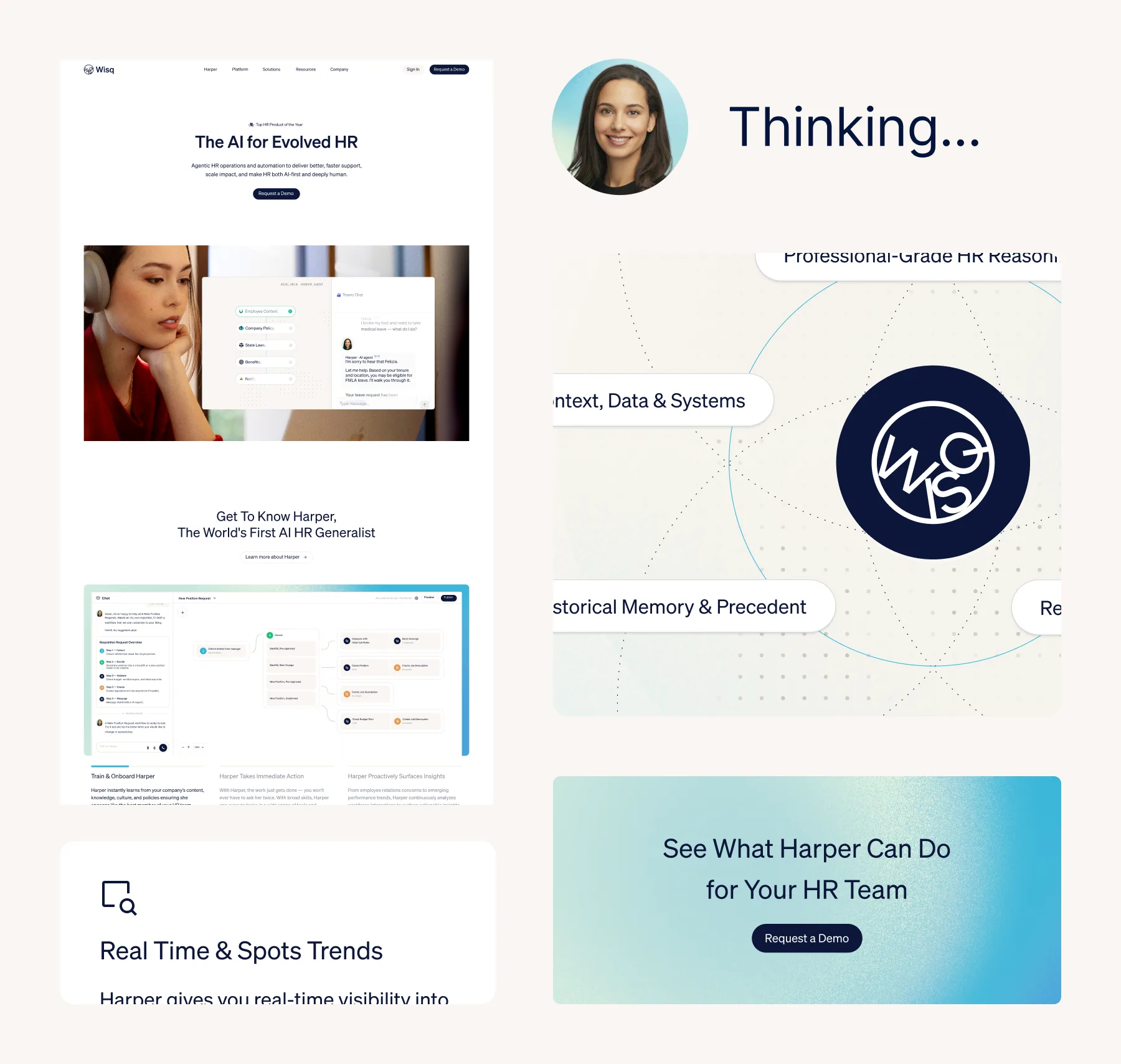
Wisq photography blends emotional warmth with technical sophistication through atmospheric lighting, soft textures, and grounded human moments.
The visual direction favors presence over perfection, capturing subtle interactions, quiet focus, and intelligence operating in the background.
Imagery should feel cinematic yet intimate, balancing ambient moods with clarity and humanity.

Downloads
Motion
Wisq’s motion system is designed to feel fluid, calm, and intentional.
Motion should help guide attention, reinforce continuity, and create a sense of responsiveness across the experience.
Transitions, ambient movement, and system behaviors should feel smooth and purposeful rather than overly expressive.

Flocking
Generative movement systems inspired by Boids behaviors.
Used for ambient motion, transitions, loading states, and adaptive visual moments.
Backstage
Subtle operational motion patterns reflecting continuous activity happening in the background of the system.
Resources
brand.md guidelines, Google Slides, Figma libraries, motion assets, product screenshots, downloadable brand files, and more.